
Investing is the easiest way to build wealth.
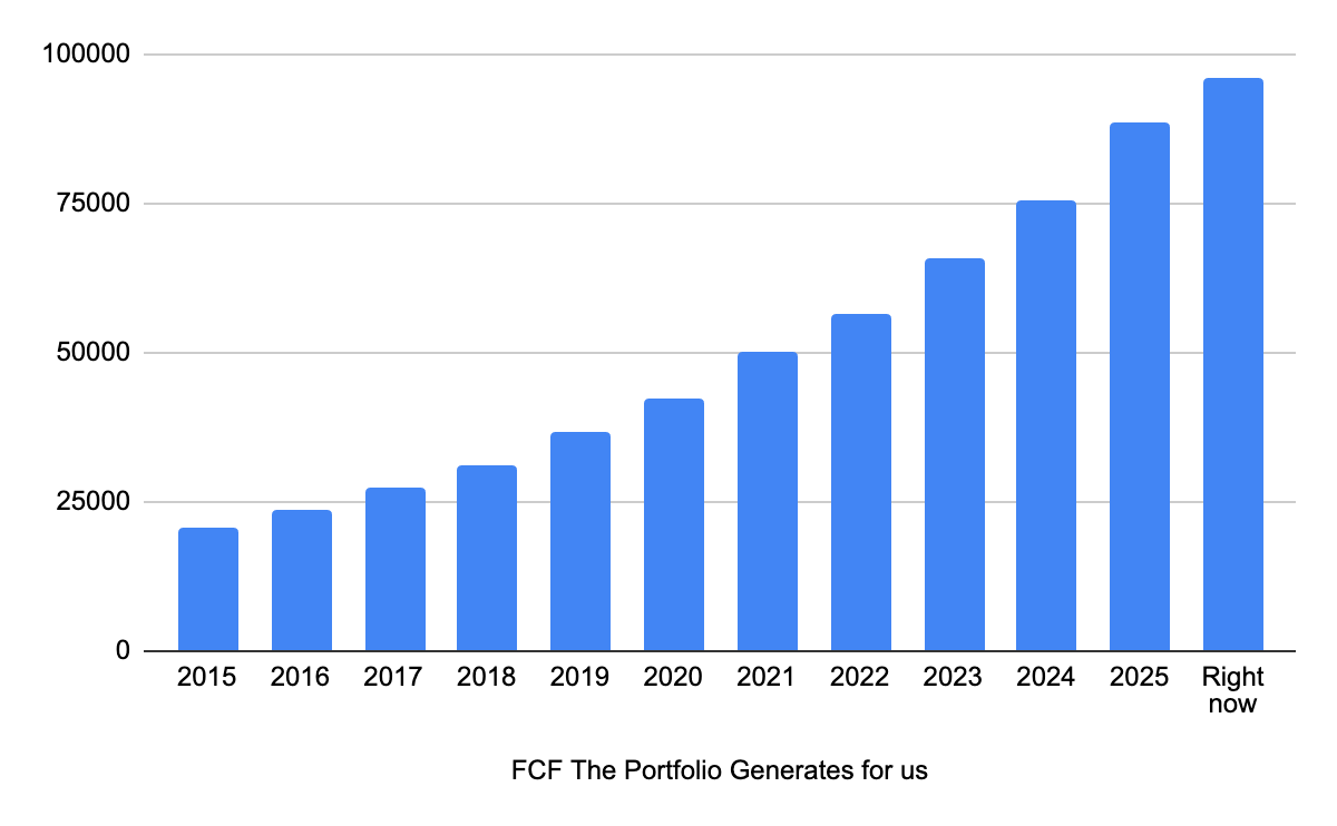
Our Portfolio is making almost $100.000 (!) in Free Cash Flow per year for us.
And this while we don’t have to work for it.
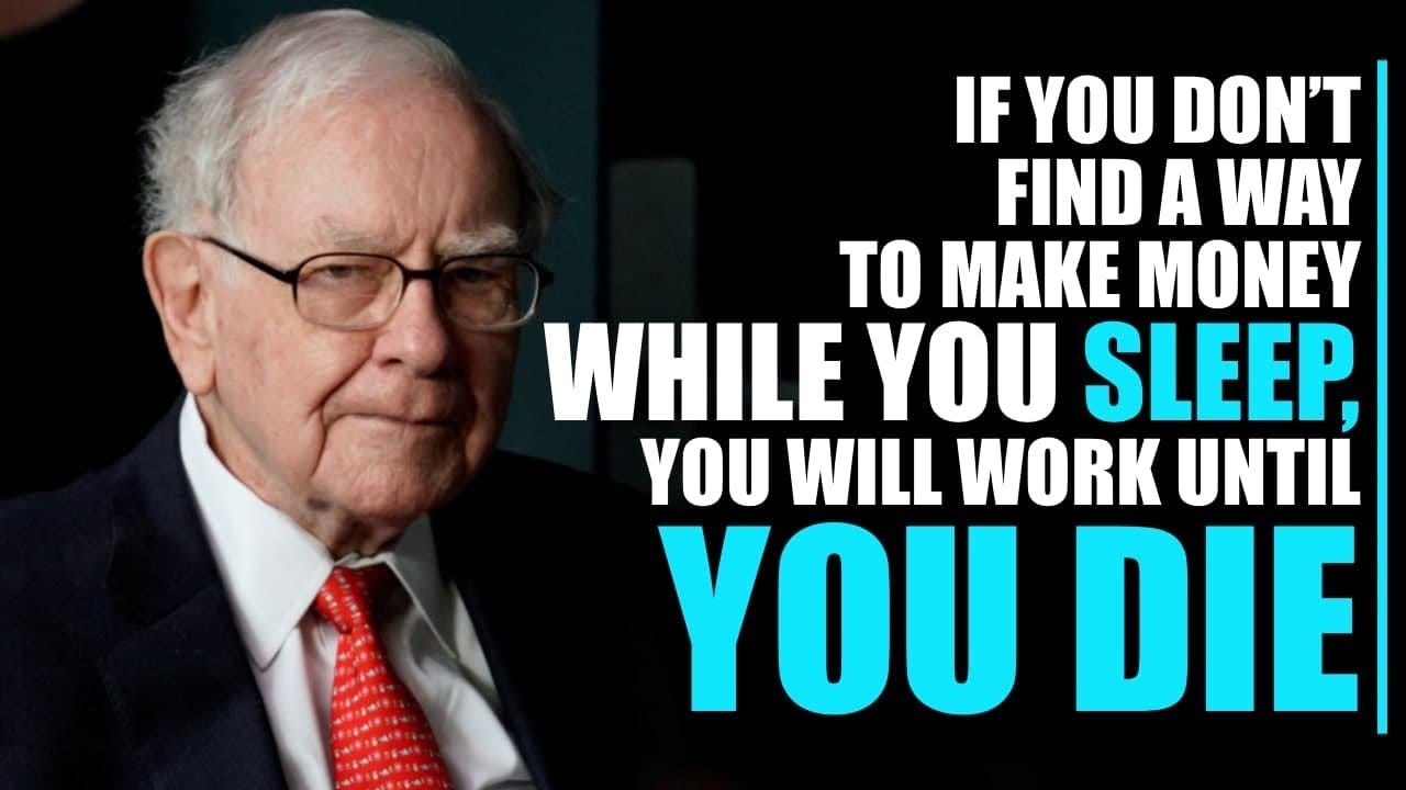
As Warren Buffett said:
Here’s what Our Portfolio makes for us:
$96.156 per year
$8,018 per month
$1,841 per week
$263.63 per day
$10.98 per hour
$0.18 per minute
Let’s dive into Our Portfolio Update today.
Berkshire Hathaway
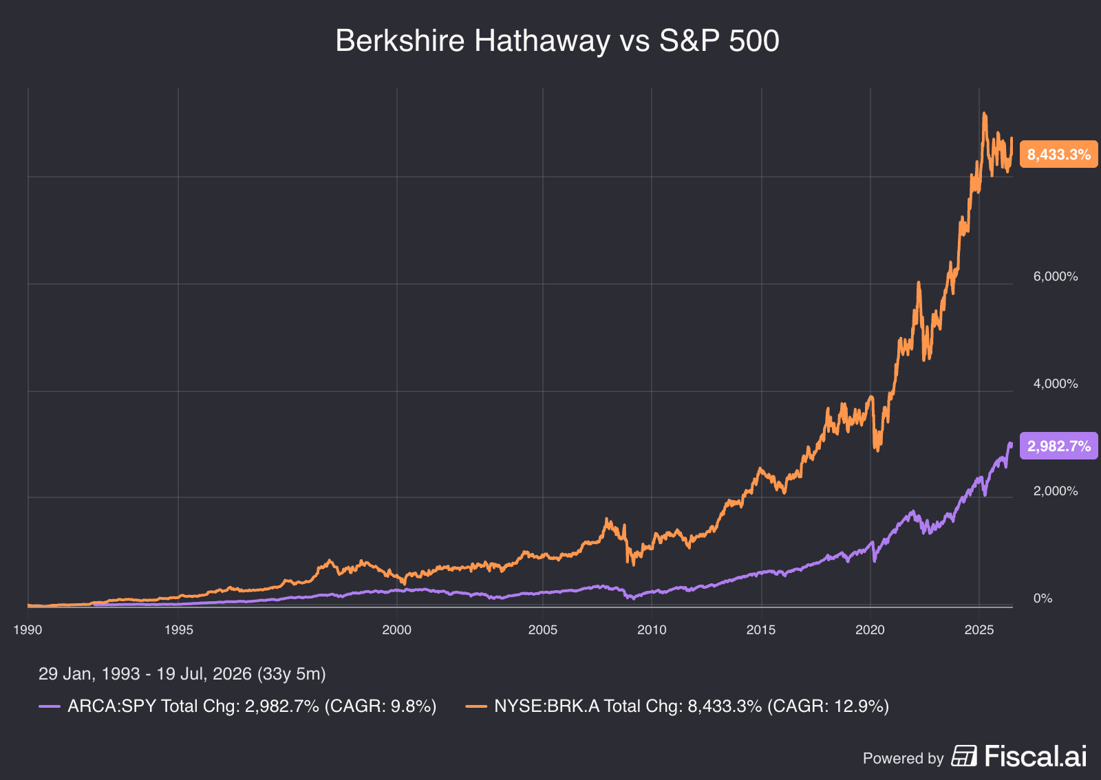
Berkshire Hathaway is the best investment holding in the world.
Here’s their track record compared to the S&P 500:
If you do the same thing as everyone else you’ll get the same results as everyone else.
What this means?
Every active investment strategy faces periods of out- and underperformance.
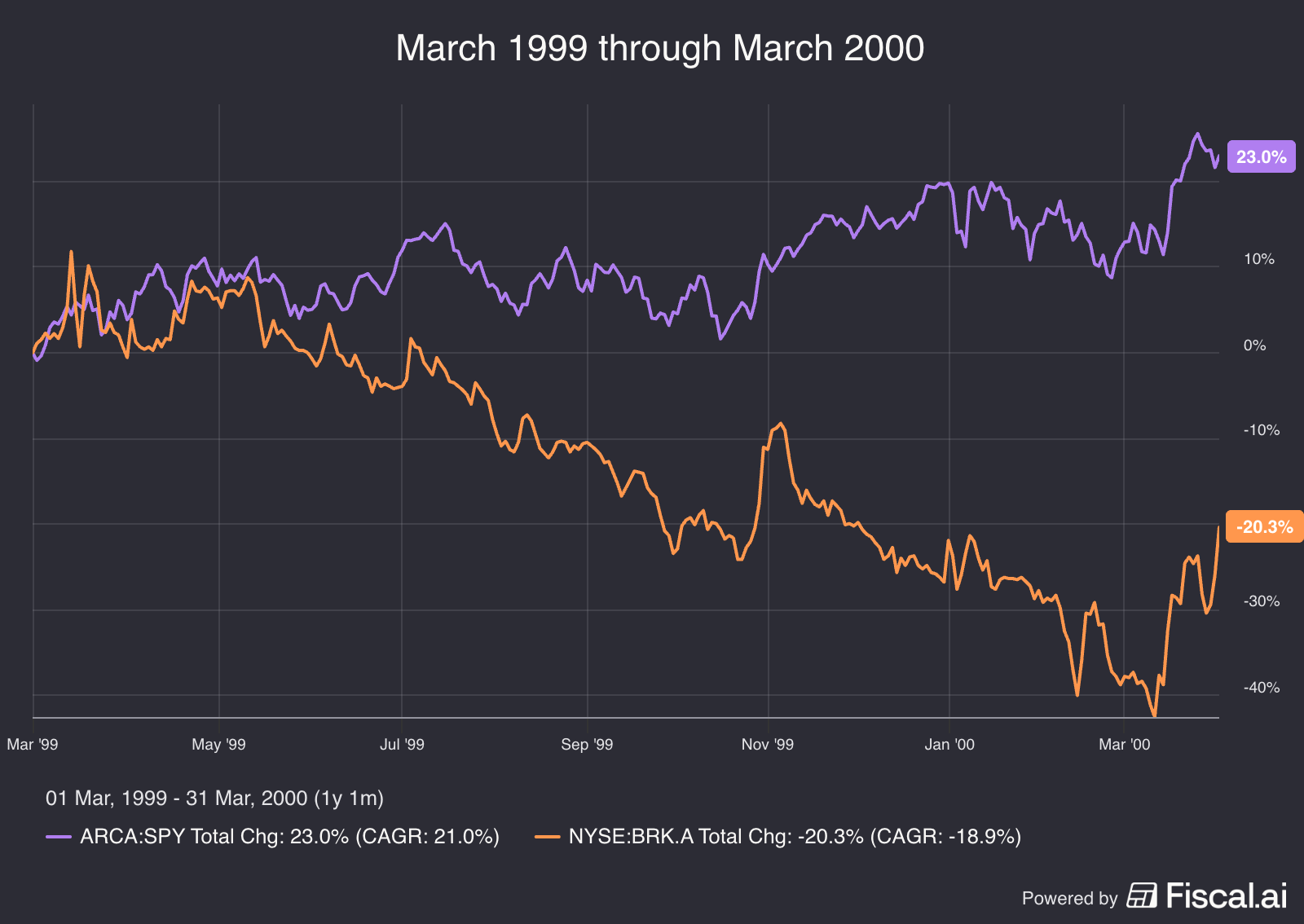
Just look at how Berkshire performed in 1999:
Berkshire Hathaway: -18.9%
S&P 500: +23.0%
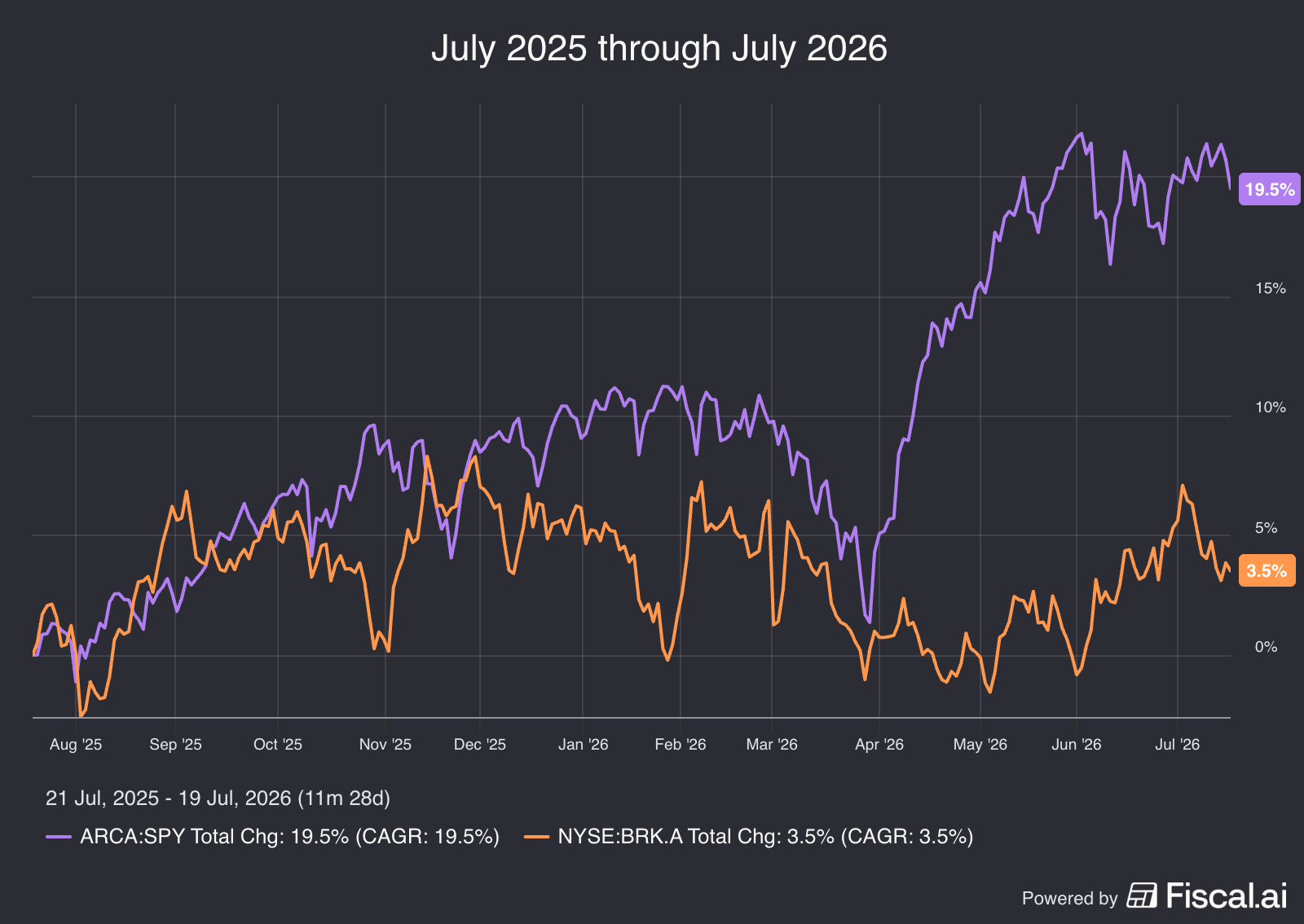
Something similar can be seen over the past year:
Berkshire Hathaway: +3.5%
S&P 500: +19.5%
The good news?
Periods of underperformance are always followed by periods of outperformance.
Especially for amazing investors like Warren Buffett.
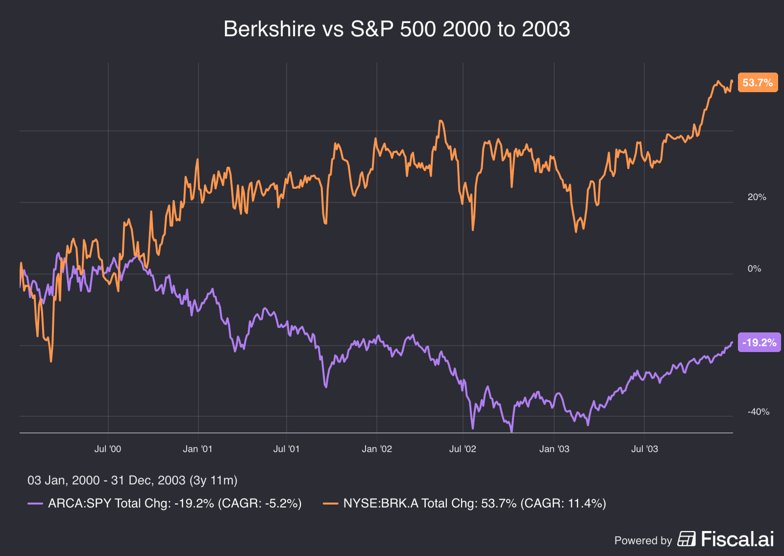
Like it did from 2000 to 2003:
Berkshire Hathaway: +53.7%
S&P 500: -19.2%
I think we could see something similar in the years to come.
There is more and more evidence that the reversal is starting.
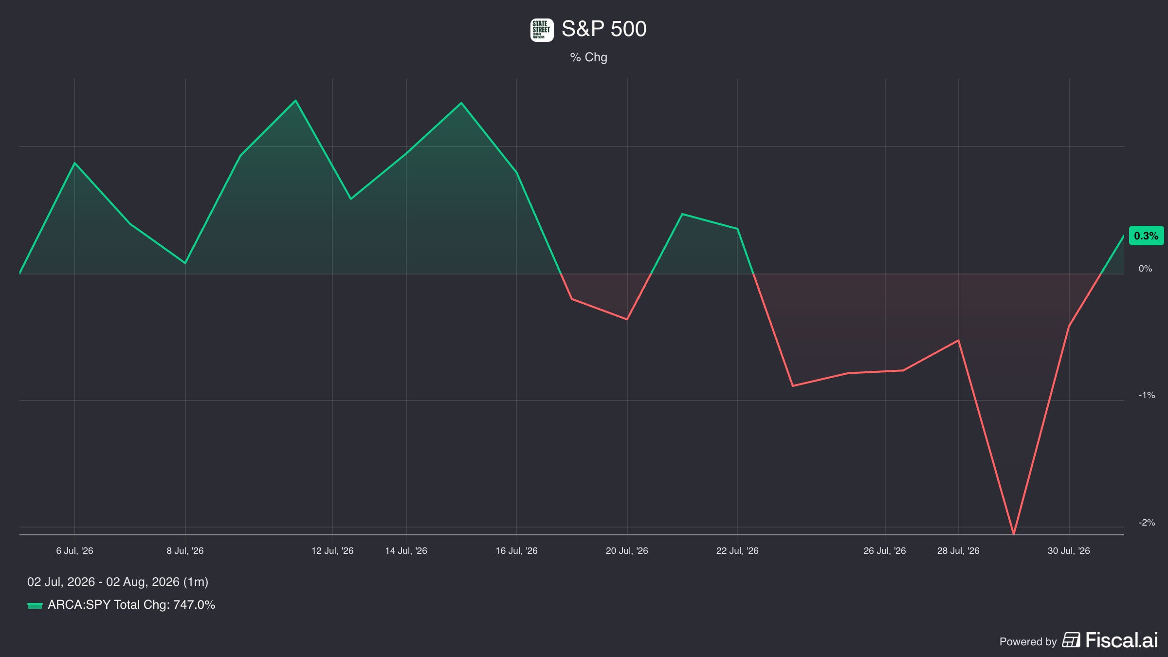
Over the past few months, the S&P 500 has been relatively flat:
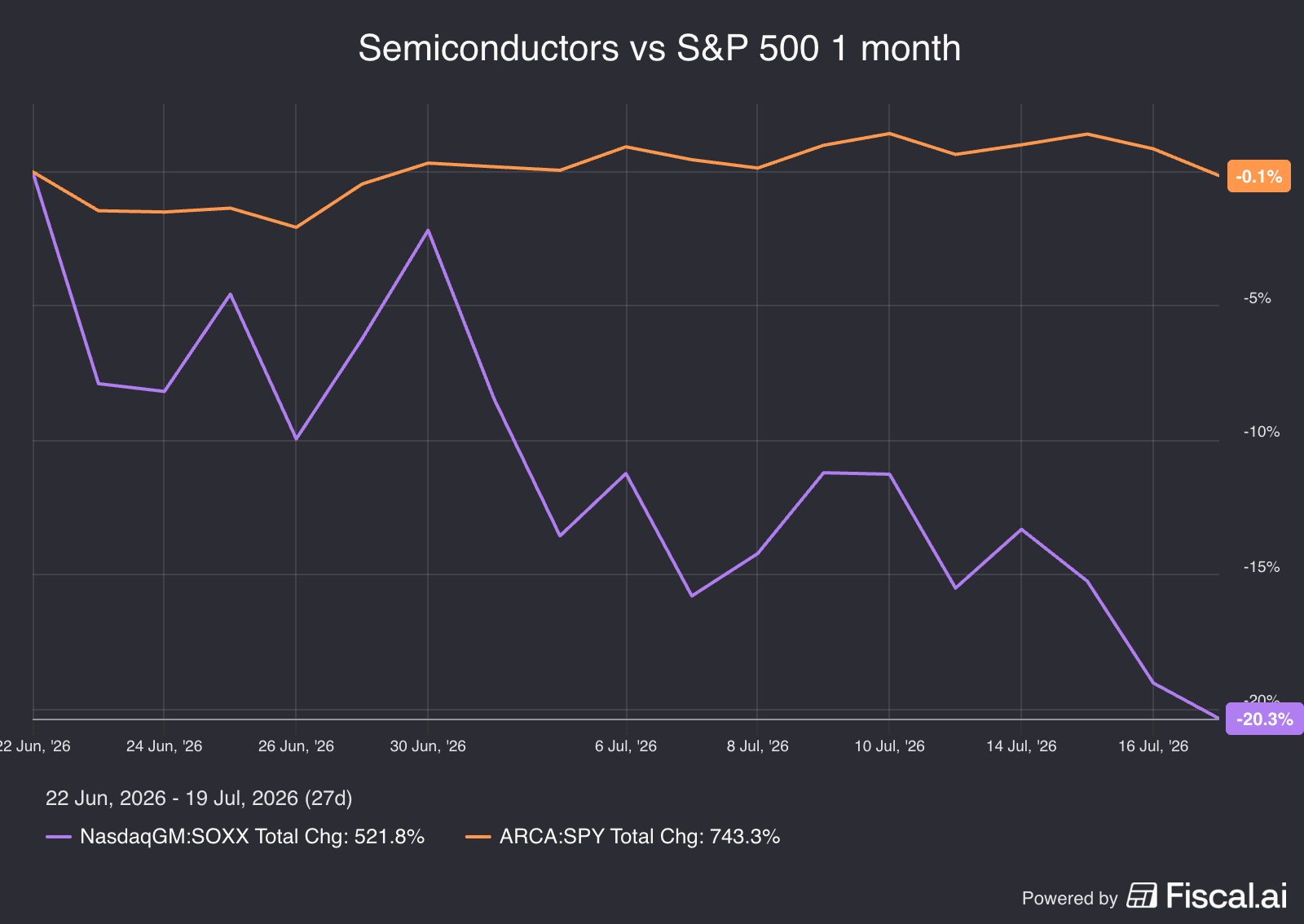
But some of the sectors that have done very well are starting to suffer.
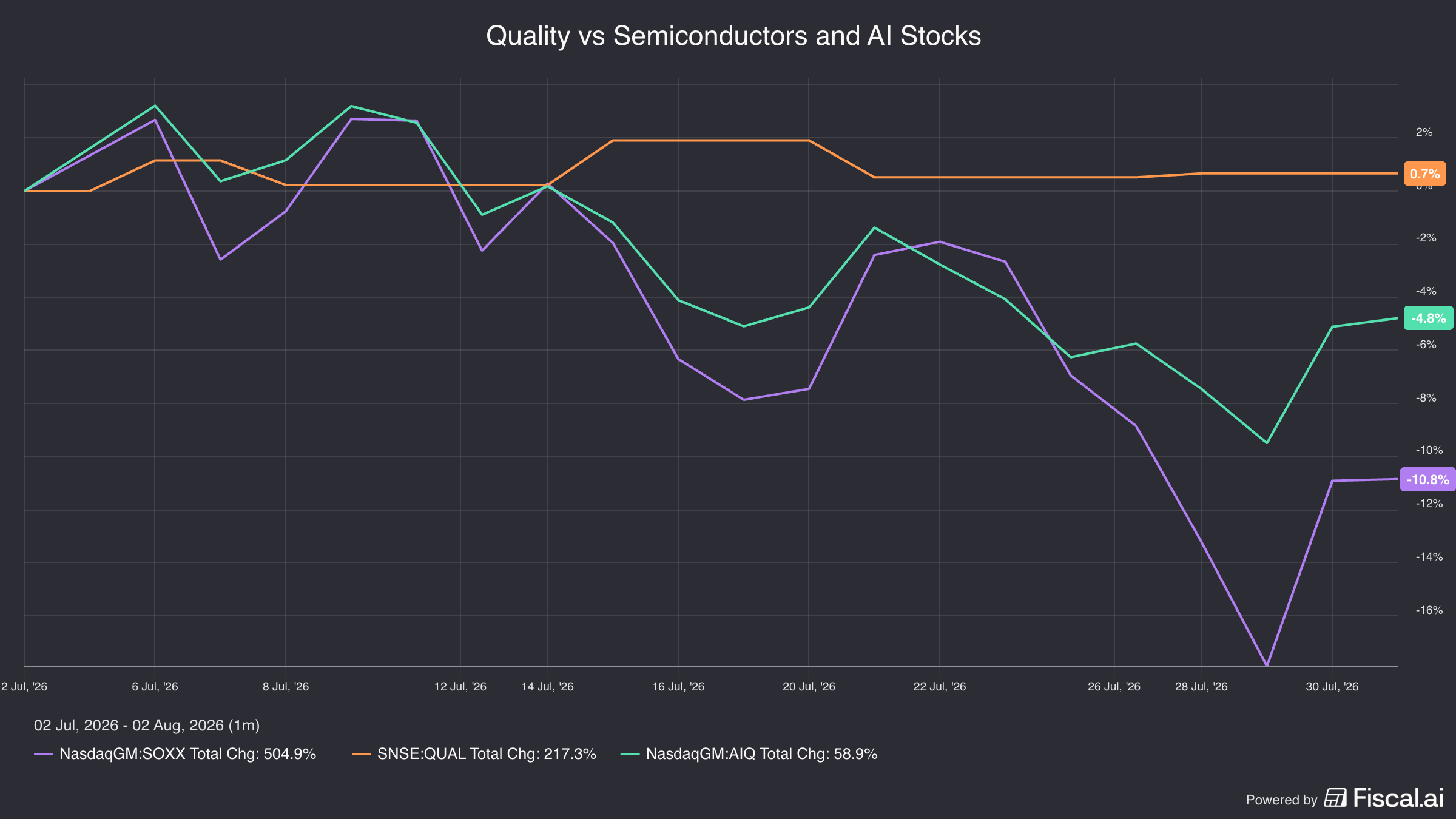
While the S&P 500 was flat, the iShares Semiconductor ETF declined by 20% in mid July:
The next chart shows the expected market volatility in two different ways:
VIX (dark blue): Measures the expected volatility of the overall S&P 500 index.
VIXEQ (light blue): Measures the average expected volatility of the individual companies in the S&P 500. In other words, it shows the expected price swings of the average stock in the index.
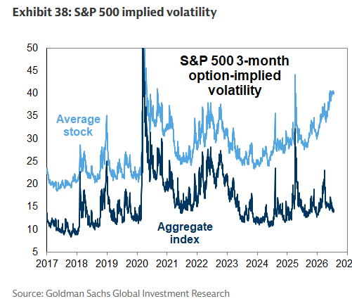
Right now, the gap between the two is much wider than usual.
Why?
Individual stocks are making large moves based on company-specific news, such as earnings reports and AI developments.
But many of these stocks are moving in opposite directions, so their gains and losses largely offset each other at the index level.
This could be a sign that the AI and semiconductor trade is cooling off.
In the meantime, investors rotate into other parts of the market.
Quality stocks have held up particularly well over the past month (orange line):
Our Portfolio
As you could already see in the chart with the Free Cash Flow, Our Companies are becoming stronger and stronger.
Year after year.
Another way to look at this?
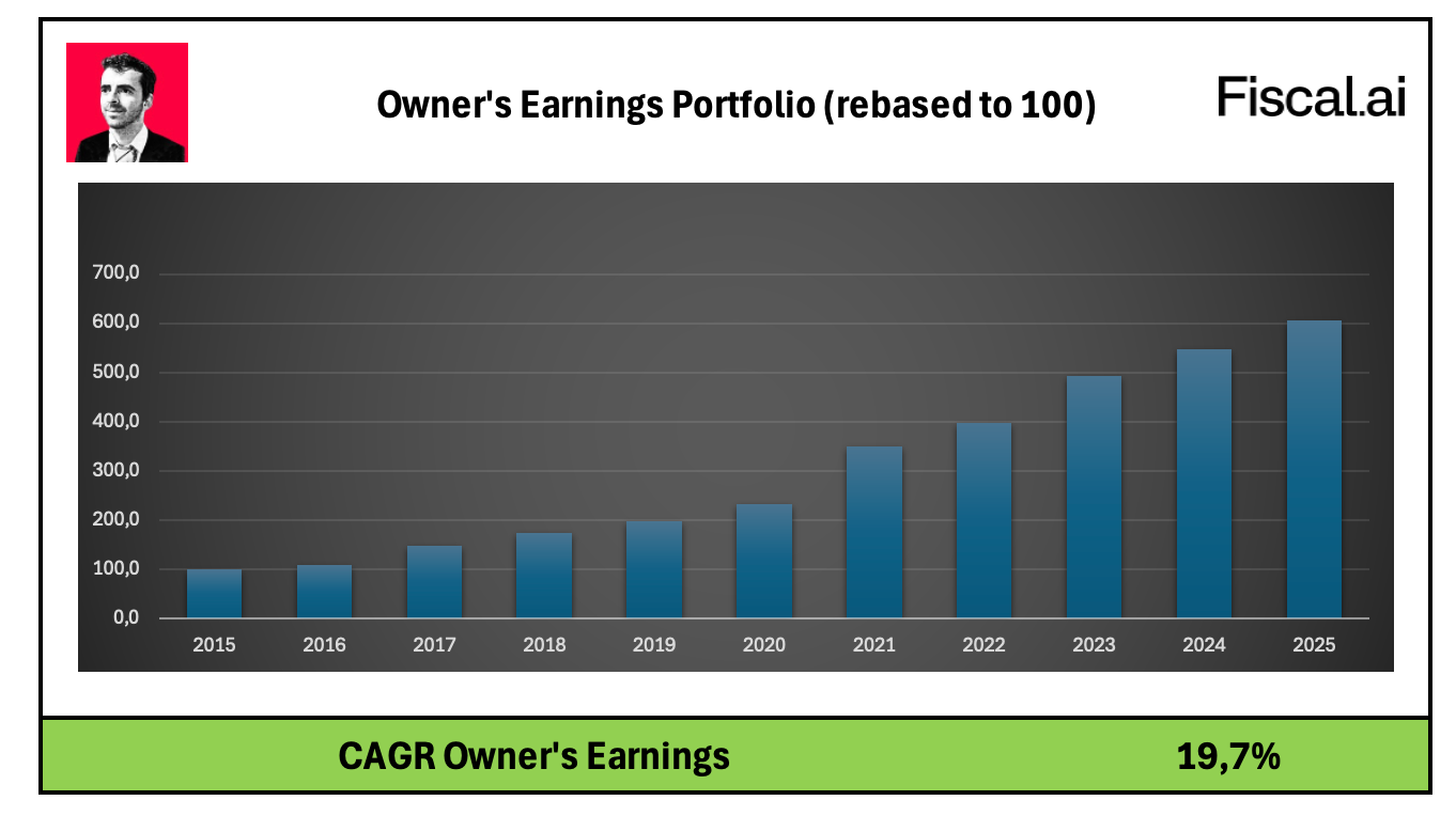
Owners Earnings.
Owners earnings = Growth in Earnings Per Share + Dividend Yield
The evolution looks as follows:
The fundamentals of Our Portfolio also looks way healthier than the S&P 500:
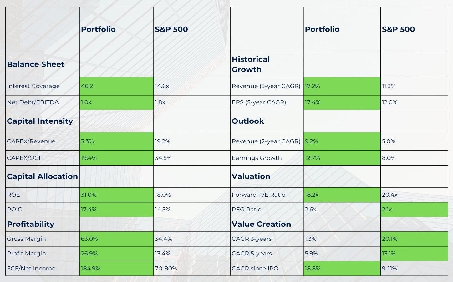
Our Portfolio is also cheaper than ever.
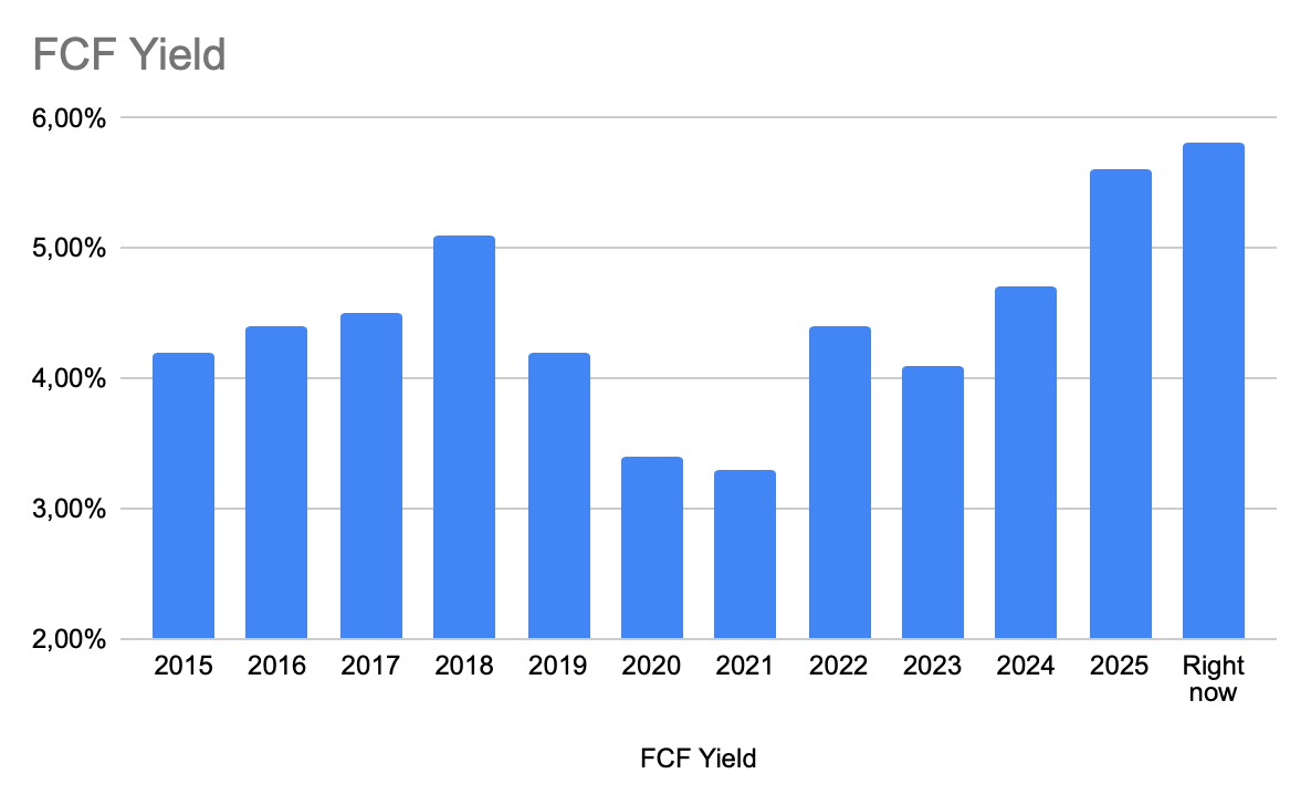
Sometimes, it takes Mr. Market time to recognize a company's true value.
Just look at this table from François Rochon:
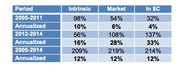
Between 2005 and 2011:
Owner’s earnings: +10% per year
Stock prices: +6% per year.
Between 2012 and 2014:
Owner’s earnings: +16% per year
Stock prices: +28% per year
But over the long run (2005–2014), Owner Earnings and stock prices both compounded at 12% per year.
The lesson?
In the short term, stock prices are driven by valuation changes.
In the long term, they follow owner earnings.
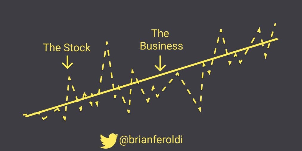
You can think about this like a rubber band.
The further away the stock price stretches from the underlying business fundamentals, the harder it usually snaps back.
My friend Brian Feroldi has a great graphic to reminds us that what matters in the long run is the business.
Let’s now dive into Our Portfolio and give an update.
